
November 21st, 2023 (update: FEBRUARY 3rd, 2024)
Normally, I don’t like to talk about the process of creating. Mainly, because it’s a private thing ... and also not particularly interesting, anyway. But the current SOPOR releases are
slightly
different to the usual, all pain-drenched albums of the past (at least in my head), so I figured
why not
?!
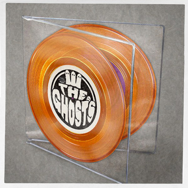
OK, so ... one awfully hot summer night earlier this year (I think it was in August), I was sitting on my daybed, looking at a photo of one of the
"
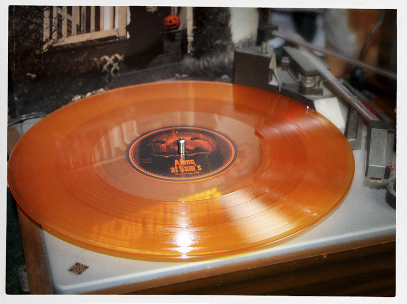
ALONE AT SAM’S - An Evening with...
"
vinyl editions on my phone...
... wishing that October was already closer and thinking to myself:
"Hmm, I would really like to have a 7"-SINGLE in transparent orange.
That would look so pretty."
(Yes,
THAT
was
literally
my entire initial inspiration / motivation. Silly, I know.)
I wondered, what I could possibly put on this theoretical 7"-SINGLE. After all, all frivolity aside, things still had/have to make sense. But then I remembered that I still had the
unused
lyrics of the
"
THE COLOURS
"
EP, which (back then) I had decided
not
to sing, as I rather wanted to keep the music instrumental instead (well, except for the song "ORANGE", which
does
have vocals).
But
four
tracks also meant that it would have to be
two
singles.
"Great, even better!"
, I thought.
So, I sat down and started designing the labels, reasoning:
"If these don't look pretty, there is really no point in even starting with the music"
...
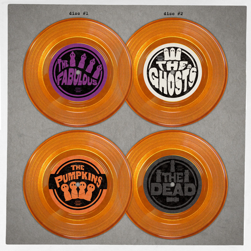
... but they turned out nicely. I liked them.
:)
Next, I imagined what the possible packaging might look like.
Since I really wanted to be able to actually
see
all this pretty, transparent orange vinyl at any given time (and not have it hidden inside a printed cover), I assumed that a
soft, transparent PVC gatefold sleeve
might be the best solution (
visually
speaking, anyway, because it's not such a good idea for long-term storage, as aging PVC will stick to the records).
This would also give it a certain “toy-like” feeling. You know, reminiscent of those horribly DALEK- sounding, yet colourful, plastic mini-records that you would insert into hideous, talking babydolls. A sort of 70s toy-vibe...
... I still liked it.
:)
So, I started working on the music...
"Perfect!"
, I thought ...
...and instantly asked my label to get in touch with Optimal Media (our current vinyl manufacturer), confidently remembering that I once saw
shaped vinyl
being offered on their homepage many years ago.
Sadly, their swift reply was:
"SORRY, WE CANNOT DO SHAPED VINYL ANYMORE."
... and I liked it.
:)
(Sidenote: depending on what device you are currently using to display this image,
the vinyl in this photo may *appear* to be more pink than orange.)
This
NEON ORANGE
also worked nicely with the new coverart, which I had finished in the meantime...
Interestingly, at first glance, this artwork doesn’t look
anything
like SOPOR at all.
;)
In fact, what it made me think of was the 1970s
SESAME STREET
playset
from
Fisher Price
(if somebody had tagged graffiti all over it)...
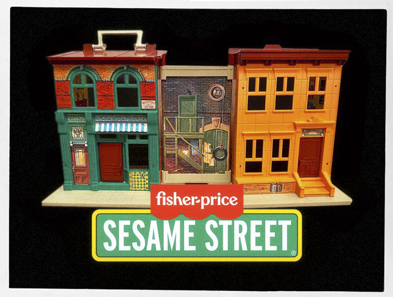
Because of this association, I couldn’t help thinking of the EP now as
The SESAME STREET album
(only in private, that is), which, in turn, made me do this silly thing ...
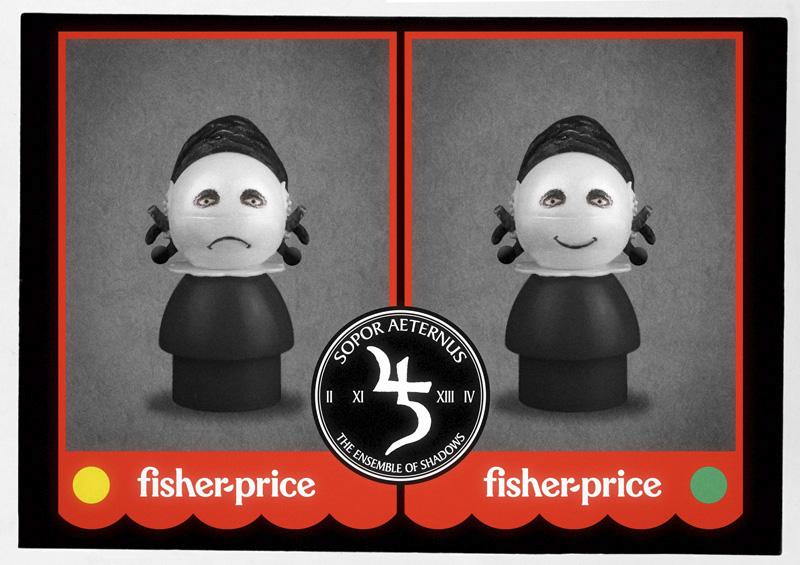
OK, just out of curiosity, which side would you pick,
LEFT
or
RIGHT
???
"Uuuurrrrrghhhh!"
So, it was back to plain, old
coloured vinyl
then.
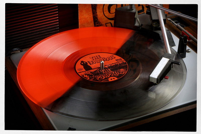
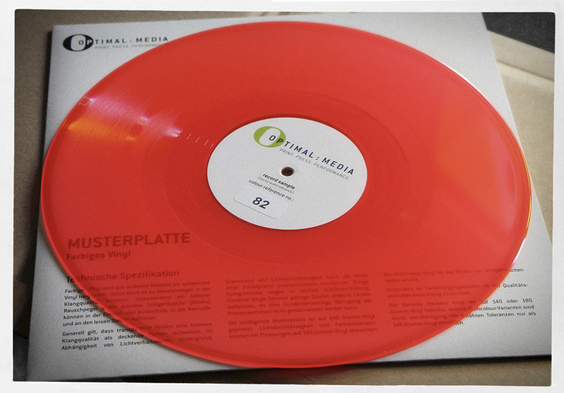
I thought about opting for a cute kind of splatter and/or marbled vinyl (though still based on orange), but Optimal Media didn’t want to lend me any of their special in-house colour-testpressings to look at in person, and since none of the photos they provided were really to my liking (the colour-mixes all seemed “dirty” to me, and I wanted something vibrant and clean), I requested a plain
NEON ORANGE
sample from their standard catalog of vinyl colours instead...
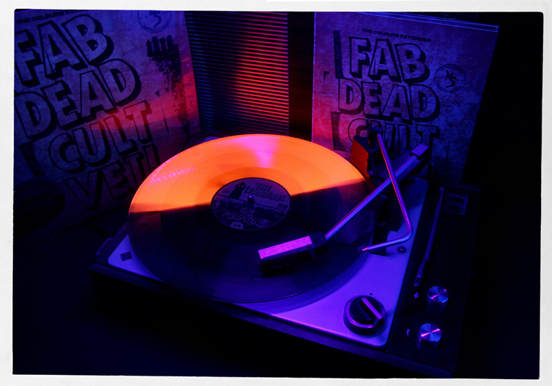
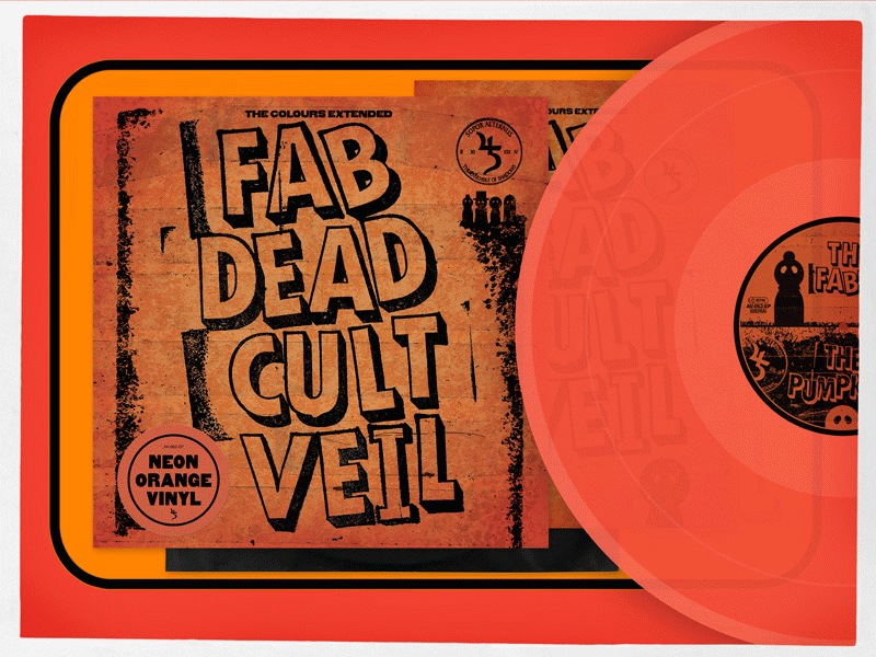
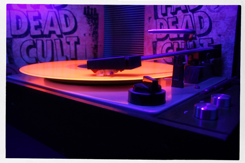
Anyway, this is how the
"
FAB DEAD CULT VEIL
"
EP came to be.
It is obviously still part of the
ALONE AT SAM’S
“storyline” (for lack of a better term), because that's where my mind is still at (partially, anyway), and it is why I
initially
wanted to release it along with the fabulously
queer
B
O
A
R
D
G
A
M
E
and the
"
THE RULES
"
album.
In theory, this would have been possible (technically speaking), because, according to Optimal Media, production times for vinyl are now (more or less) back to the way they were before 2020.
But then I was worried that it would be
waaaaaay
too much stuff for people to digest all at once. On top of that, we spontaneously decided to move the release of the
B
O
A
R
D
G
A
M
E
and the
"
THE RULES
"
album ahead by a few months, so now
"
FAB DEAD CULT VEIL
"
is kind of its own thing.
Sort of. Not really. But, well ... you know what I mean.
;)
Ironically, the first song I wrote turned out to be longer than 5 minutes already, which kicked the entire idea of 7"-SINGLES straight out of the window (because the recommended runtime at 45 RPM in 7"- singles is about 4:10 min).
Grrrrrrrr
.
"I guess, it’ll have to be a 12-inch EP then"
, I sighed
and started working on new labels and the coverart (just to be on the safe side).
The problem with this, however, was that I had already
used
both transparent
and
opaque orange vinyl in 12” format before, and a repetition would be stupid and kind of embarrassing.
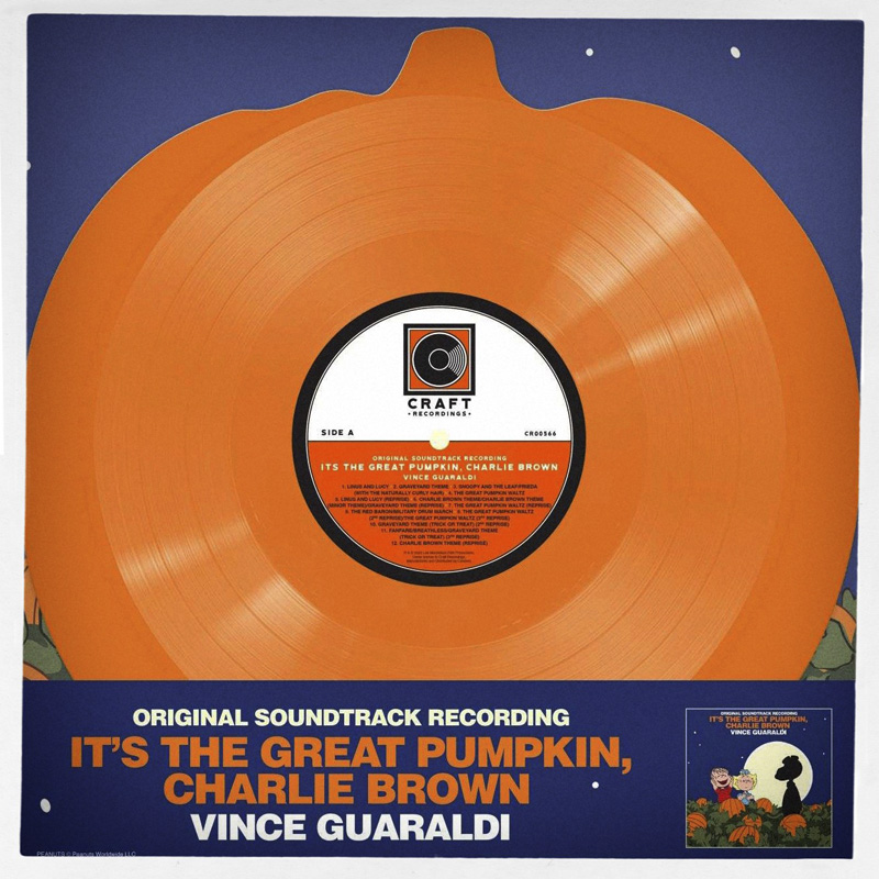
"Okay, how about a 12-inch record in the shape of a PUMPKIN then?!"
, I mused.
This would not only make complete sense, but it would certainly be something new for SOPOR as well. Plus, I knew that it was totally possible to make (in theory), because the exact same thing had been done for Vince Guaraldi’s soundtrack of
IT’S THE GREAT PUMPKIN, CHARLIE BROWN
a few years ago...
So, in the end, I didn't get the transparent 7"-single I had initially desired, but what I received instead, I actually find way more interesting and fun. Also because, as it turned out, this
neon-orange
is UV- reactive, so it
glows brightly
under
blacklight
...
Oh, and those four songs are really
beautiful
, too. :)
+ + +
P.S.: Because this release was essentially an afterthought, the gatefold CD-edition is not going to fit into the nice box (the one with the loveable monster on the lid) anymore, because that box was
specifically
designed for just
three
albums. Sorry about that. That's how it goes sometimes.